


With as many as 32 major reports on food systems out in the past few years, the topic is clearly a popular one. Yet most of these reports have been on strategy and framing the issues; as food systems undergo rapid changes, especially in low- and middle-income countries, it’s time to move beyond frameworks and concepts to delve into how transformations can actually occur.
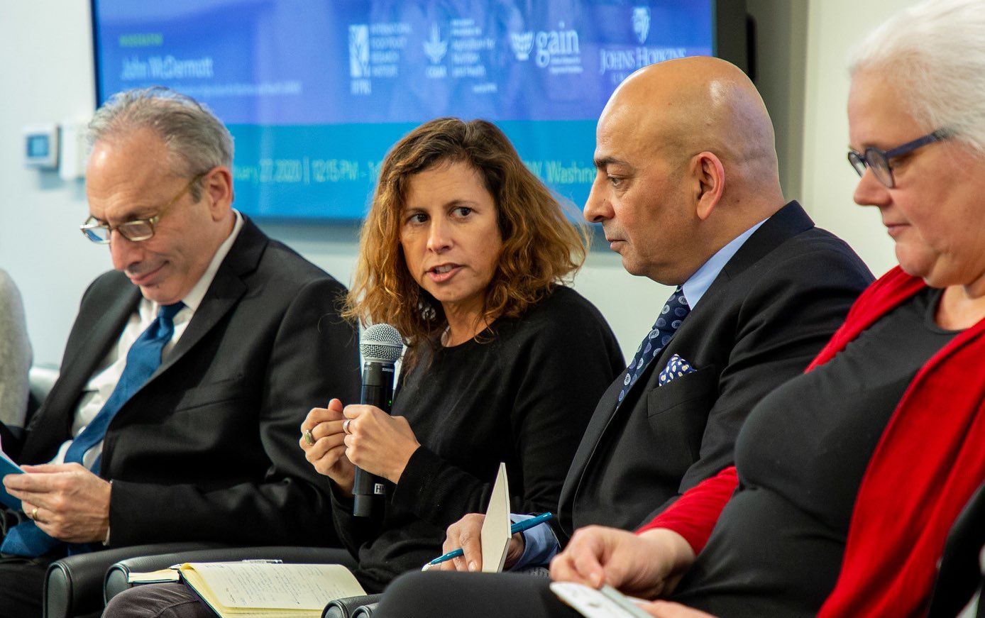
This was how John McDermott, director of the CGIAR Research Program on Agriculture for Nutrition and Health (A4NH), outlined the challenge at a Jan. 27 IFPRI-A4NH policy seminar giving a sneak peek of the forthcoming Food Systems Dashboard, a tool intended to help policy makers and other stakeholders better understand this key issue.
The Dashboard is being developed by the Global Alliance for Improved Nutrition (GAIN) and Johns Hopkins University (JHU), in collaboration with iTech Mission, Michigan State University, and Euromonitor.
GAIN Executive Director Lawrence Haddad shared the background on how the Food Systems Dashboard idea came to be. In conversations in countries where GAIN works, he said, one issue kept coming up among stakeholders ranging from policy makers to the private sector: People are unsure what actions need to be taken to make food systems more inclusive of sustainability and nutrition, and they don’t know where to go for information. The data that describe food systems, Haddad noted, are scattered among many organizations and sources, and stakeholders need a place where they can go to get the full picture.
The goal for the Dashboard, Haddad said, is to take users through three steps. First, a description of the food system in their country. Second, a diagnosis of which parts of that system are working, which are in trouble, and which areas require more data and other information. Third, drawing on that diagnosis, providing people with what they need to make decisions—the policies, finance mechanisms, business and technology innovations, and other elements needed to point the system in the right direction.
The Dashboard’s purpose is to bring available data together so policymakers can get a holistic picture of their food system, said Jessica Fanzo, Bloomberg Distinguished Associate Professor of Global Food & Agricultural Policy and Ethics at JHU—including being able to see where the gaps are, and to make comparisons with experiences and situations elsewhere. The Dashboard brings together more than 150 indicators from different parts of the food system, including the food environment, drivers, consumer behavior, nutritional status, and diets. Fanzo stressed the importance of ensuring that the Dashboard’s datasets were available for most countries, not just high-income ones as is often the case. In some areas, this requirement made it hard to assemble data—for instance, in many countries only a small number of indicators currently exist for consumer behavior and individual factors.
The Dashboard includes basic information about how food systems function and snapshots of food systems in different countries. The Dashboard then enables users to compare those profiles, and to do a deeper dive into the data, with about 25 indicators that cut across topics and countries. Interactive maps delve into dynamics and trends. Over time, the Dashboard will also include downloadable country profiles and other tools designed to better equip stakeholders with information they need.
The primary audience envisioned for the Dashboard, Fanzo added, are policy makers, who need quick access to understandable information about their food systems, and to understand what other countries are doing and how they are progressing. The creators hope the tool will provide a way for people to easily identify what is working, or not working, in a given food system without becoming overwhelmed by the quantity of available data, and then use that information to develop actions based on where problems or opportunities exist and what others in similar situations have experienced.
The seminar was aimed at sharing the Dashboard’s goals and approach with others working in food systems research. Panelists provided feedback that included suggestions to enable information to be accessible by sector as well as at the national level; to recognize the need policy makers have to connect food systems decisions to the Sustainable Development Goals; and to offer solutions and experiences beyond simple fixes so that stakeholders will be able to recognize and address often complicated system dynamics.
The Dashboard is expected to be live within the next few months.
Janet Hodur is a Communications Specialist with the IFPRI-led CGIAR Research Program on Agriculture for Nutrition and Health (A4NH). This post also appears on the A4NH website.